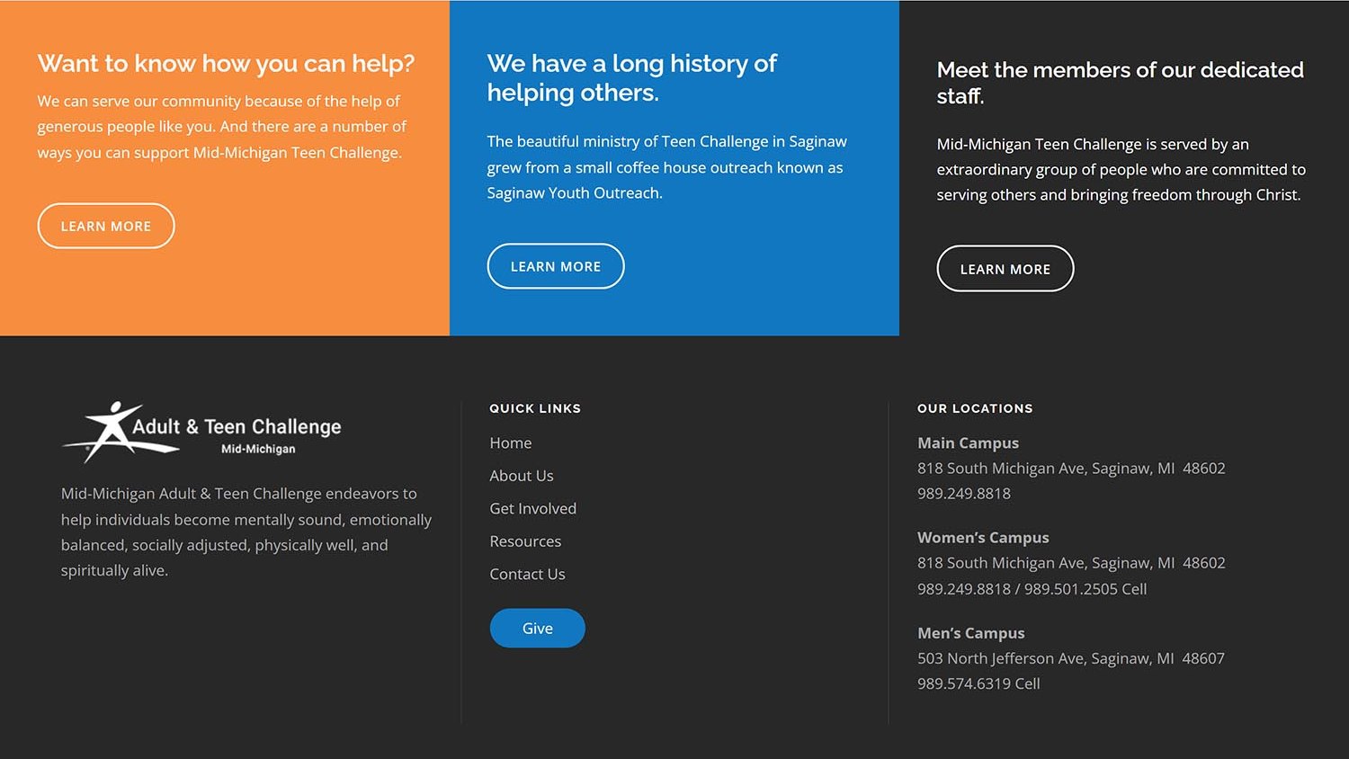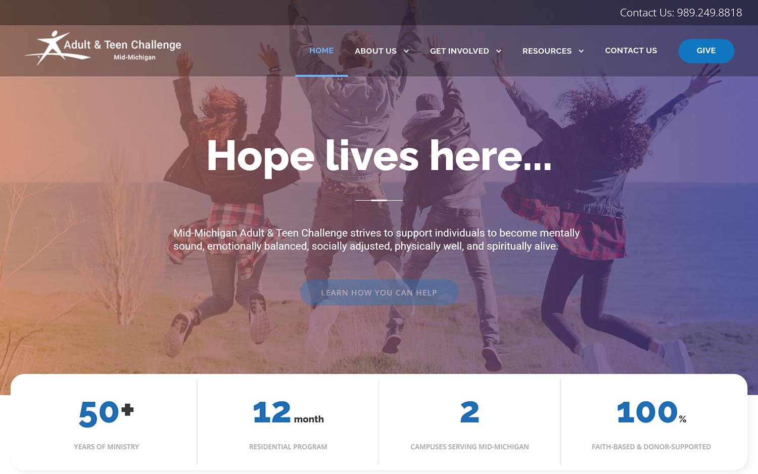

Mid-Michigan Adult & Teen Challenge runs a twelve-month residential program in Saginaw for adults working to overcome addiction and other life-controlling issues. It is faith-based, it is long-term by design, and it operates two campuses — one for men, one for women.
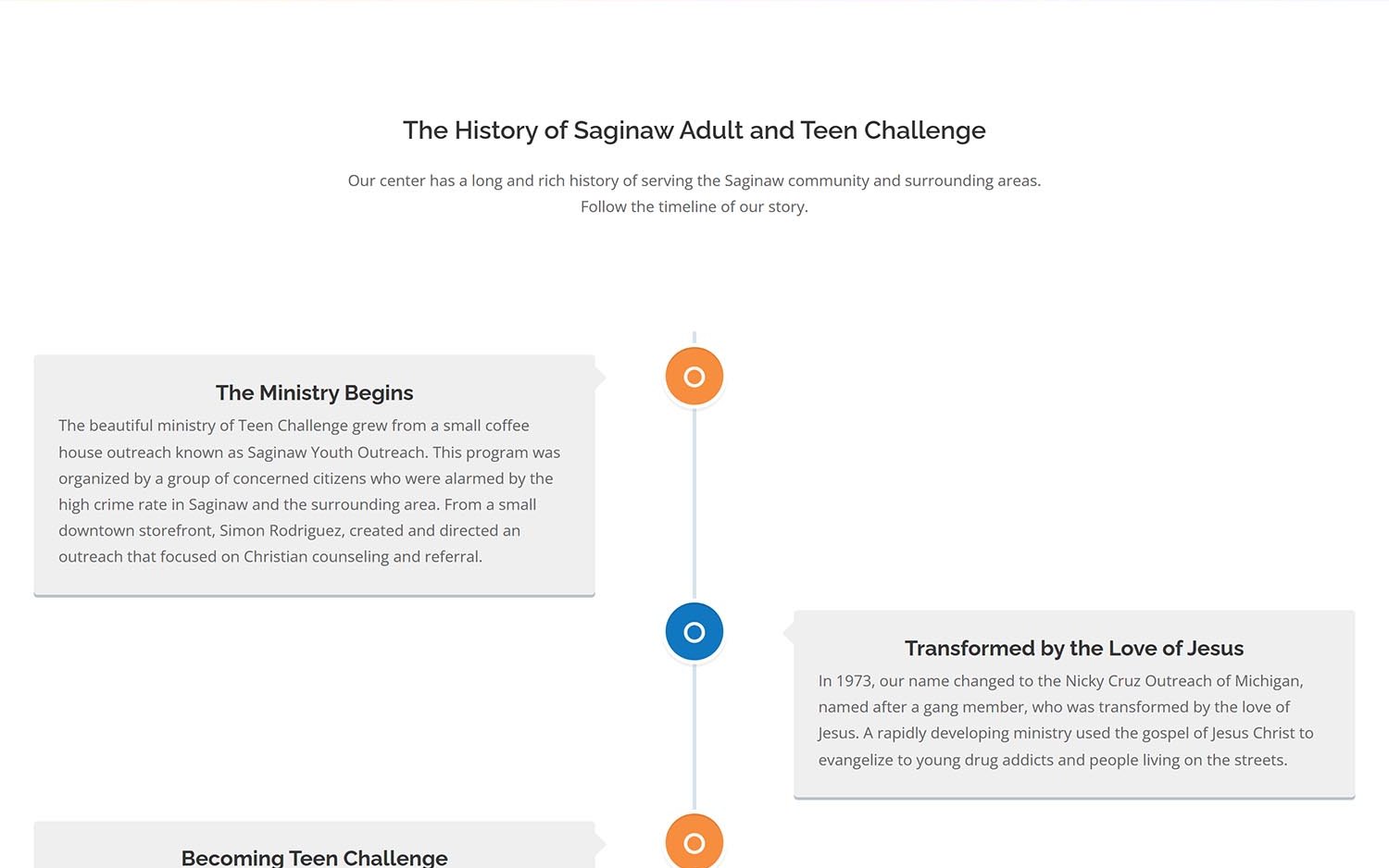
The organization traces back more than fifty years, from a Saginaw coffee house outreach through a series of names and mergers to the program it runs today. That history is real and specific, and almost none of it had ever been written down anywhere a visitor could find it.
Most website projects begin with content that needs improving. This one began with content that did not exist. No copy deck, no photo library, no messaging framework — a mission everyone involved could describe out loud and nobody had ever put on paper.
The harder part was that the site had to speak to three completely different readers at once. Someone in crisis, or a family member searching on their behalf, who needs to know what the program is and whether they qualify. A donor deciding where money goes. And a volunteer or church partner looking for a way in.
Those three arrive with different questions and different emotional states. A single generic About Us serves none of them.
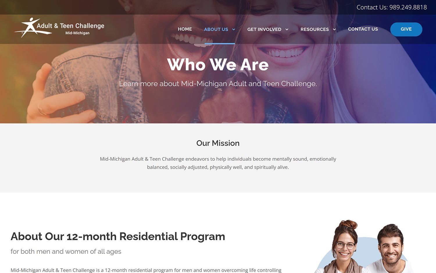
We interviewed, researched, and wrote the entire site — the program description, the history, the staff introductions, the giving pages, the calls to action. Then we built the structure around the three audiences rather than around the organizational chart, so each reader lands somewhere written for them.
The tone was the real design decision. Writing about addiction recovery invites two failure modes: clinical distance that feels like a pamphlet, or emotional pressure that feels like a pitch. We aimed for plain, warm, and specific instead — concrete about what the twelve months actually involve, honest about what the program asks of a person, and free of the language that makes people in genuine difficulty close a browser tab.
We also wrote the history properly, as a timeline with dates and names. A fifty-year record of showing up in the same city is one of the most persuasive things this organization has, and it had been sitting unused.
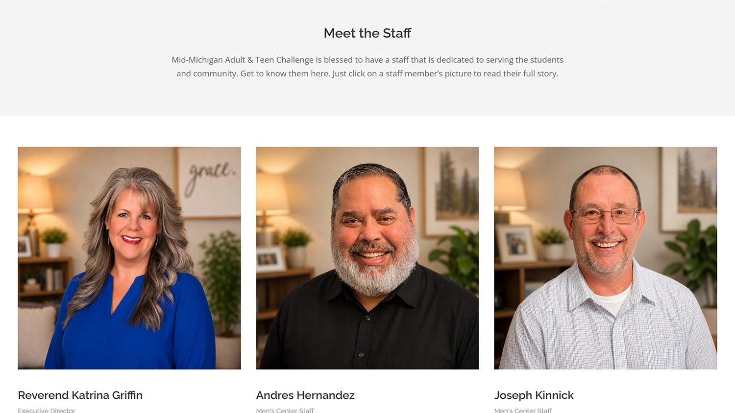
We produced the full visual library for the site. That work carries an obligation most projects don’t: the imagery has to convey community, dignity, and ordinary daily life without exposing anyone in the program or trading on anyone’s worst moment.
So the pictures show what the year actually looks like — people cooking together, the campus houses, shared spaces, small routines — rather than the visual clichés the subject usually attracts. No before-and-after framing, no stock despair. A residential program is mostly the quiet parts, and the photography reflects that.
Alongside the photography we built a simple set of illustrated wayfinding cards for the three audiences, so the homepage can direct a visitor to the right path within a few seconds of arriving.
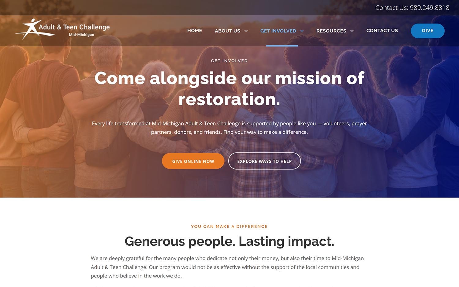
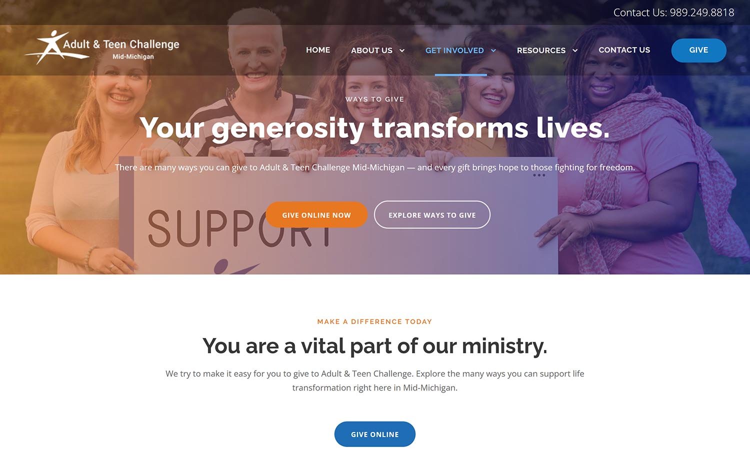
A single contact form would have collapsed everything into one inbox and one shape of message. Instead we built custom communication forms matched to why someone is writing — asking about the program, offering to volunteer, becoming a prayer partner, or getting in touch generally.
Each one asks only what that conversation needs. Someone reaching out about entering the program should not be answering questions designed for a donor, and staff should be able to tell at a glance which kind of message just arrived.
We did the same with giving. The needs list, in-kind donations, sponsorship, and the full range of planned giving options each get their own clear explanation, so a supporter can find the way they want to help rather than being pushed toward the one the website found easiest to build.
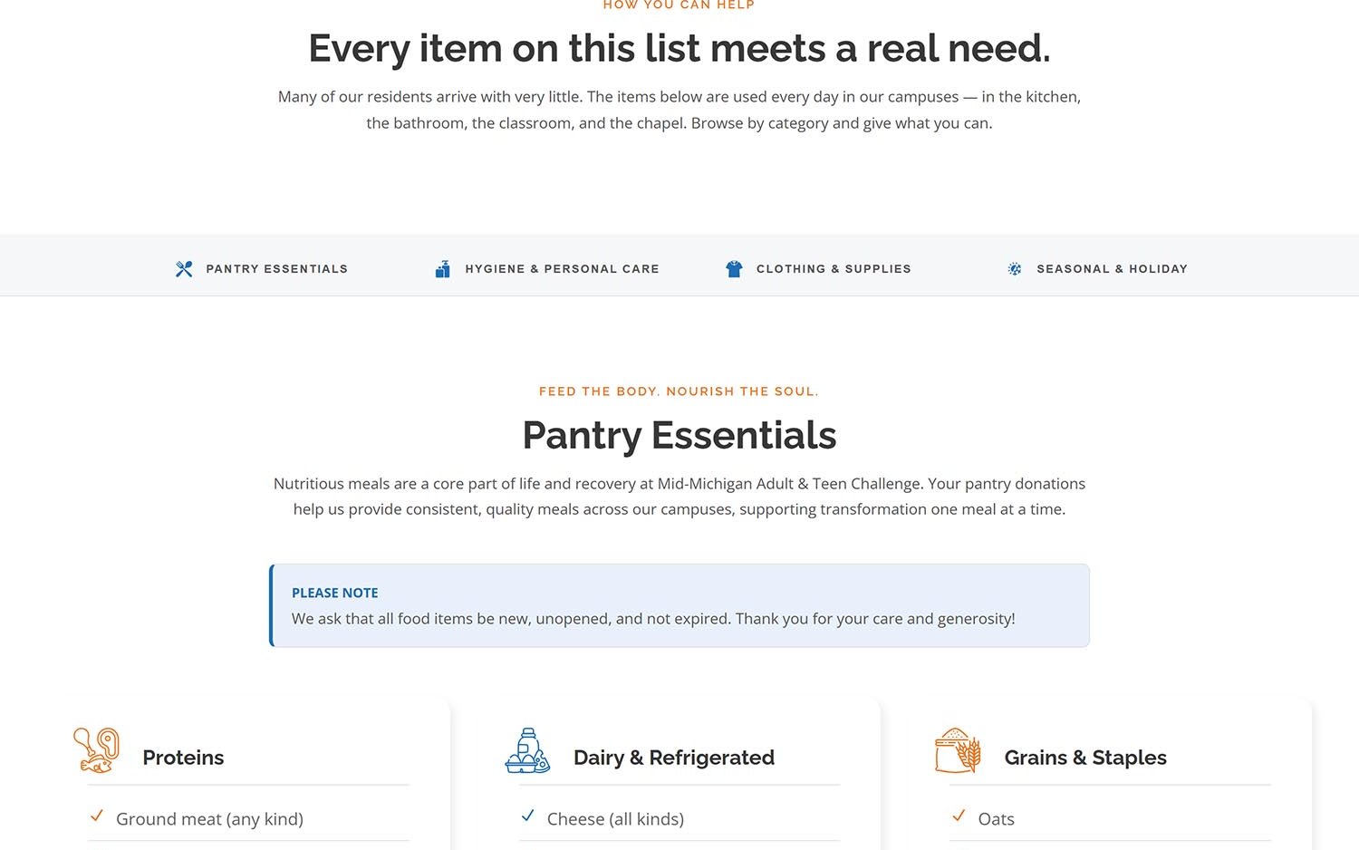
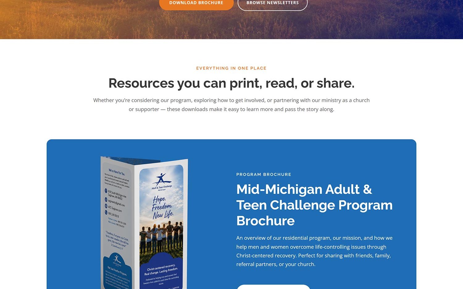
The organization now has a site that presents at the level of the program behind it. The mission is stated plainly. The history is on the record. Staff have faces and names. Supporters have a dozen concrete ways to help and a page explaining each of them.
None of that changed what happens on the two campuses. It changed whether a family searching at eleven at night can tell that this place is real, established, and worth a phone call — which for a nonprofit is most of what a website is for.