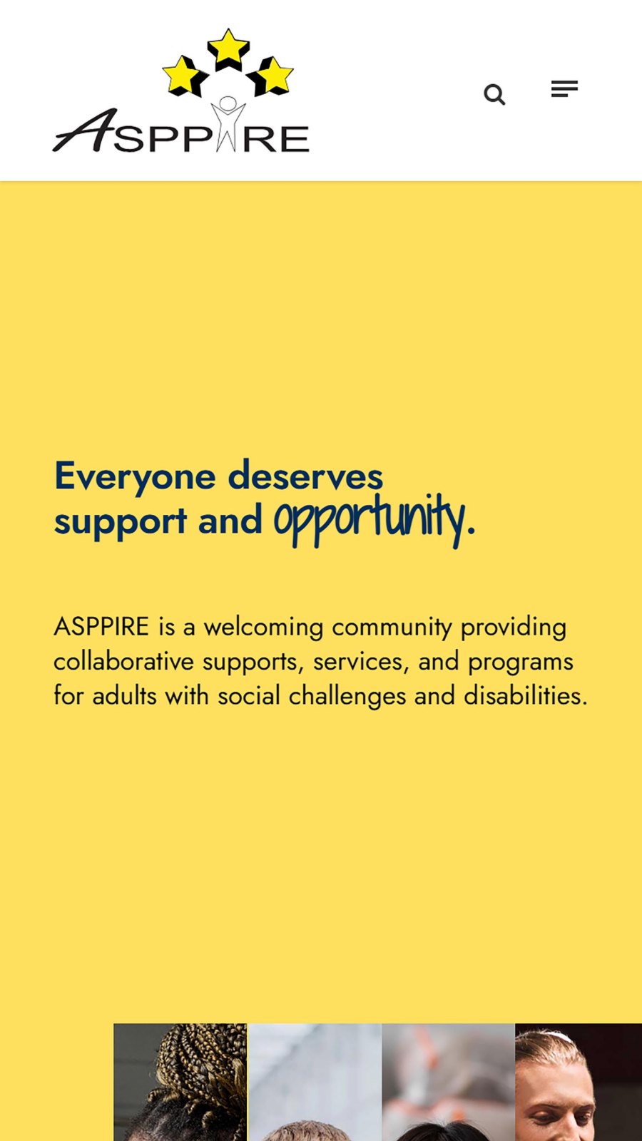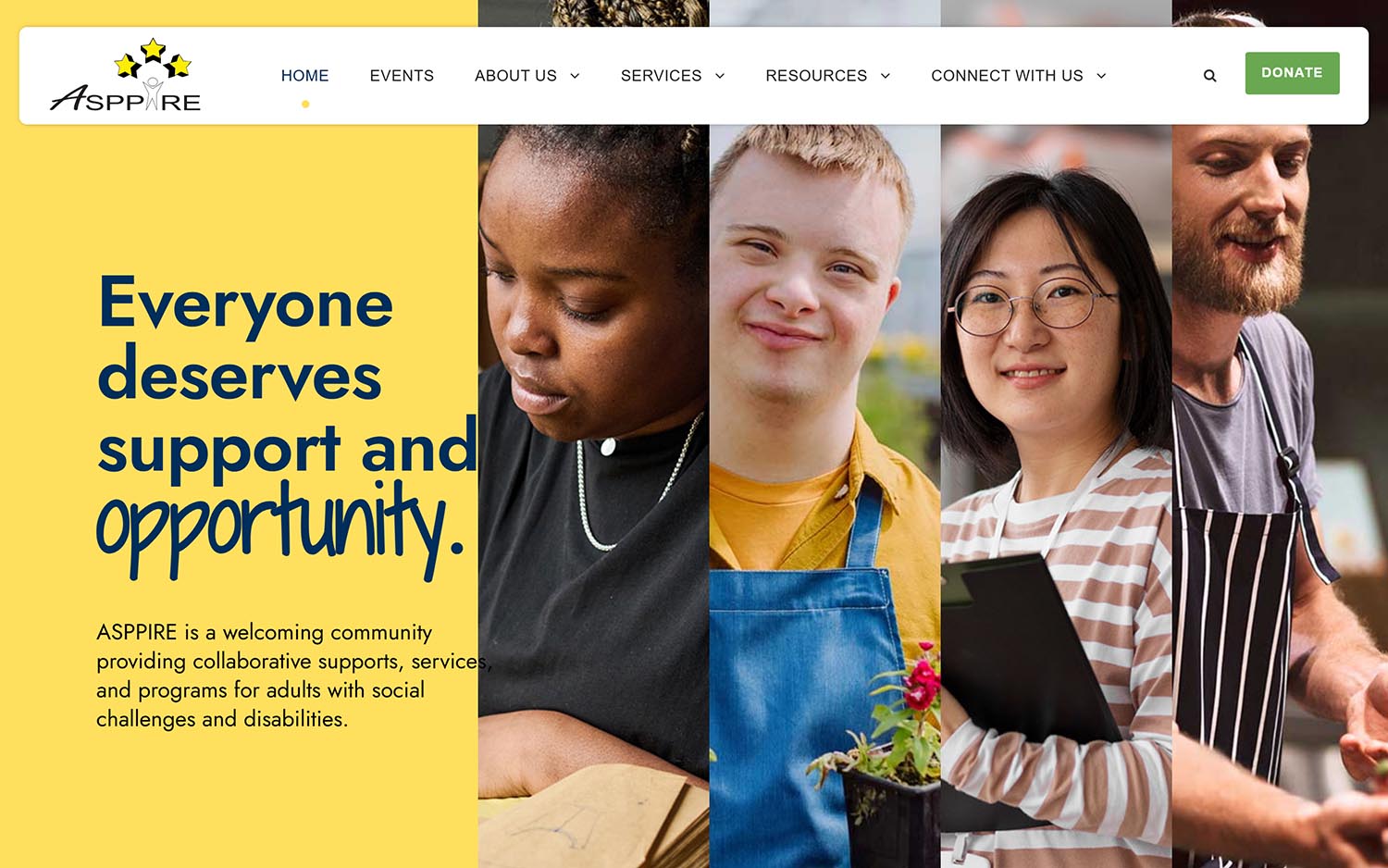

That line is ASPPIRE’s, not ours, and it sits at the top of their homepage because it is the whole point. ASPPIRE of Mid-Michigan is a Lansing nonprofit that describes itself as a welcoming community providing collaborative supports, services, and programs for adults with social challenges and disabilities — adults eighteen and older, many of them on the autism spectrum.
Founded in 2008 by a retired special educator and granted nonprofit status a few years later, ASPPIRE runs facilitator-led social coaching in twelve-week sessions three times a year, along with employment supports, case management, and professional training. Much of it is funded by private donations.
The work is warm, personal, and social by design. The website needed to be all three.
Nonprofits accumulate tools. Over the years ASPPIRE had built up a working set of forms for event registration, volunteer signups, and donations — forms their staff knew, that fed into places they understood, and that nobody wanted to touch.
The temptation on a project like this is to rebuild all of it. Custom registration, custom donation flow, custom everything. It would have been a bigger invoice and a worse outcome. A small nonprofit team does not need a new system to learn. They need their existing one to stop being hard to find.
So the brief narrowed to something more useful: give the organization a website bold enough to match its energy, and give the forms they already had a proper home inside it.
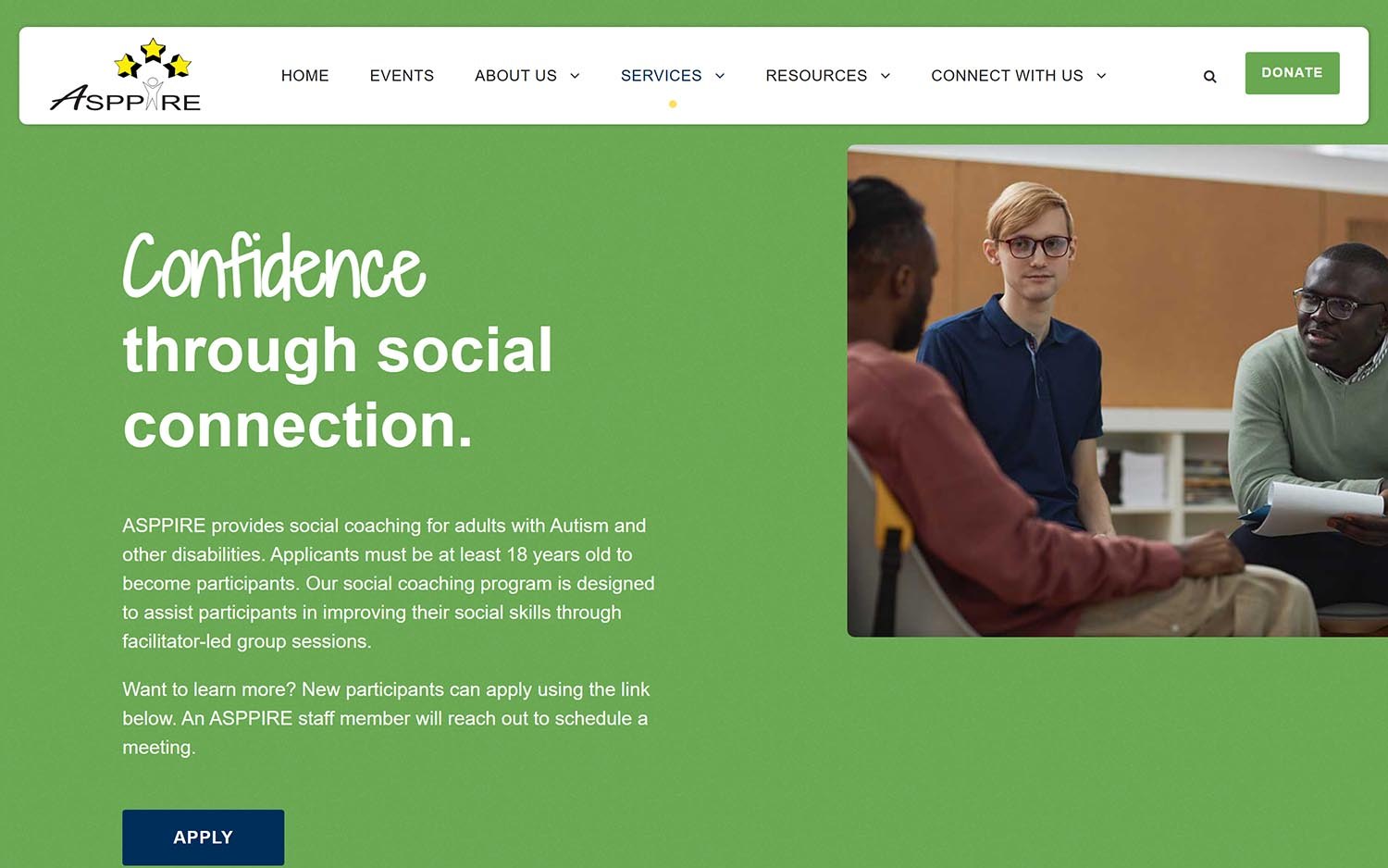
Disability services websites tend to default to soft blues and careful, institutional restraint. ASPPIRE isn’t an institution. It’s a place people go on a Tuesday night to play shuffleboard and paint and get better at being around other people.
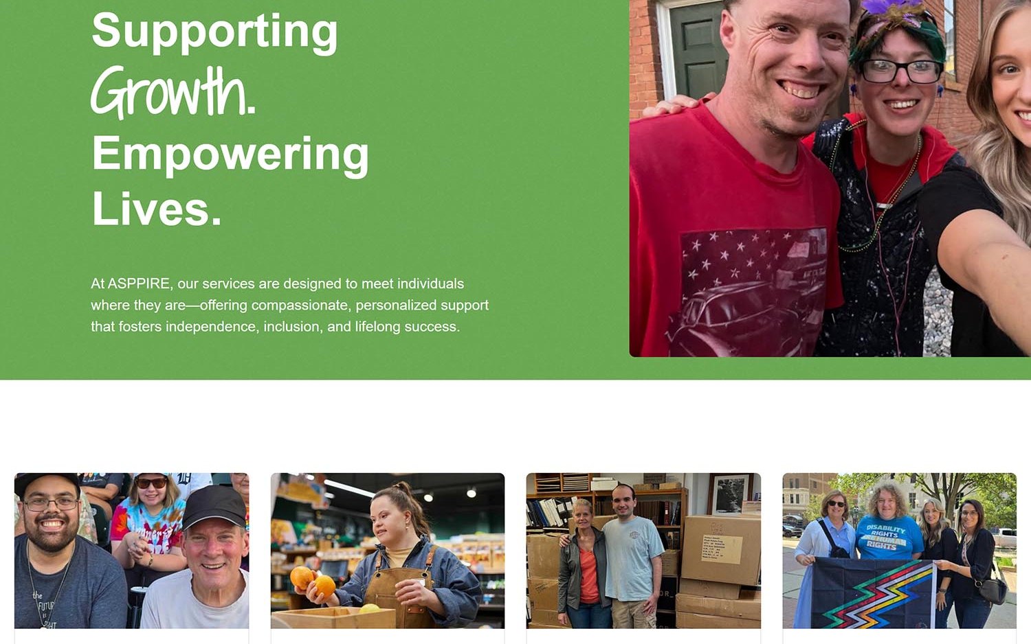
We built the site bright, bold, and full of colour — large type, generous imagery, high-contrast blocks, and a homepage that leads with people rather than programs. The tone follows the organization’s own language: Empowering Every Journey, Supporting Growth. Empowering Lives., Confidence through social connection.
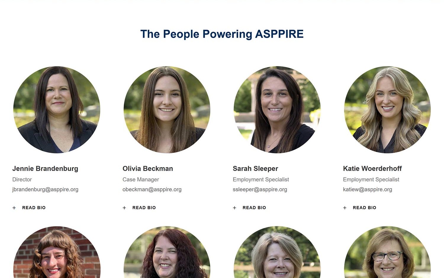
The service pages each stand on their own — social coaching, employment supports, case management, professional training — so a family arriving from a search result lands somewhere that answers their question rather than somewhere that requires a tour. Staff and facilitators get real profiles, because for a program built on relationships, the people are the offering.
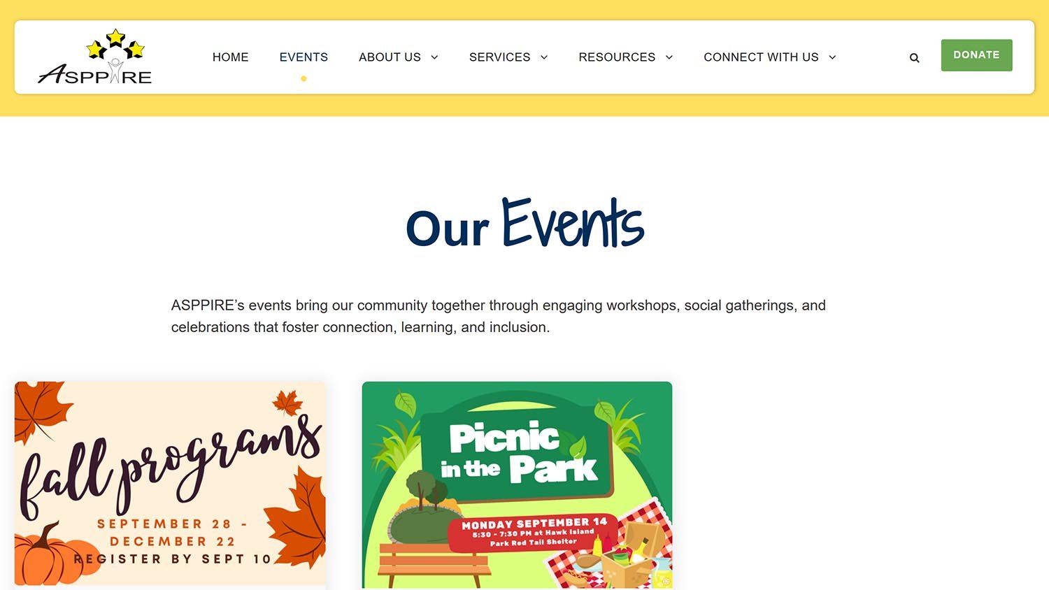
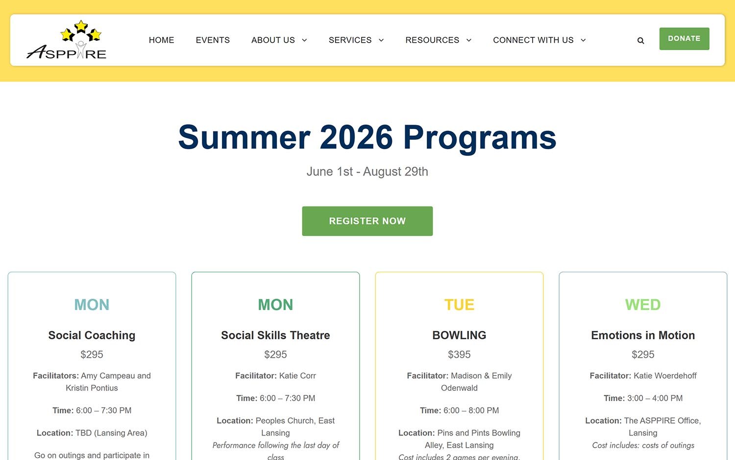
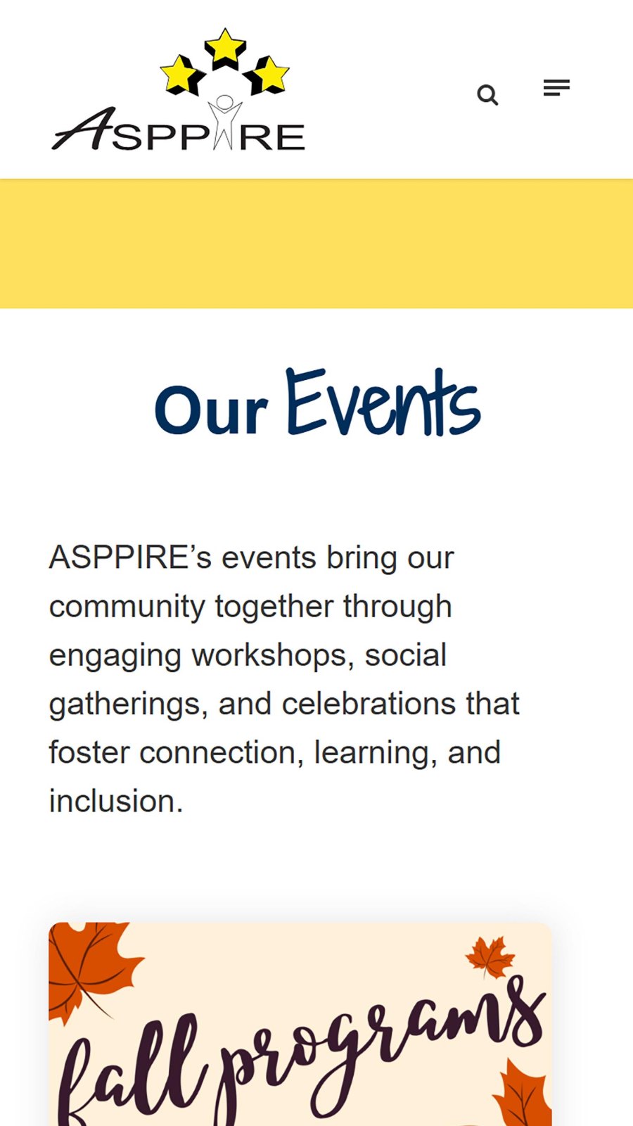
Events are how ASPPIRE reaches people. Summer programs, a shuffleboard tournament, a paint-and-sip night — each one needs a page that can go up quickly, look good on a phone, and be shared straight into a Facebook post.
We built the events section as a visual grid of cards that each open onto a full detail page. Staff can publish a new event with a graphic and a description in minutes, without a developer and without a ticket. The registration form for each event is the one ASPPIRE already used — embedded directly in the page, so a visitor never gets bounced somewhere unfamiliar, and staff never have to learn a new tool.
Donations and volunteer signups work the same way: their existing forms, housed inside pages that make sense, on a site that looks like the organization.
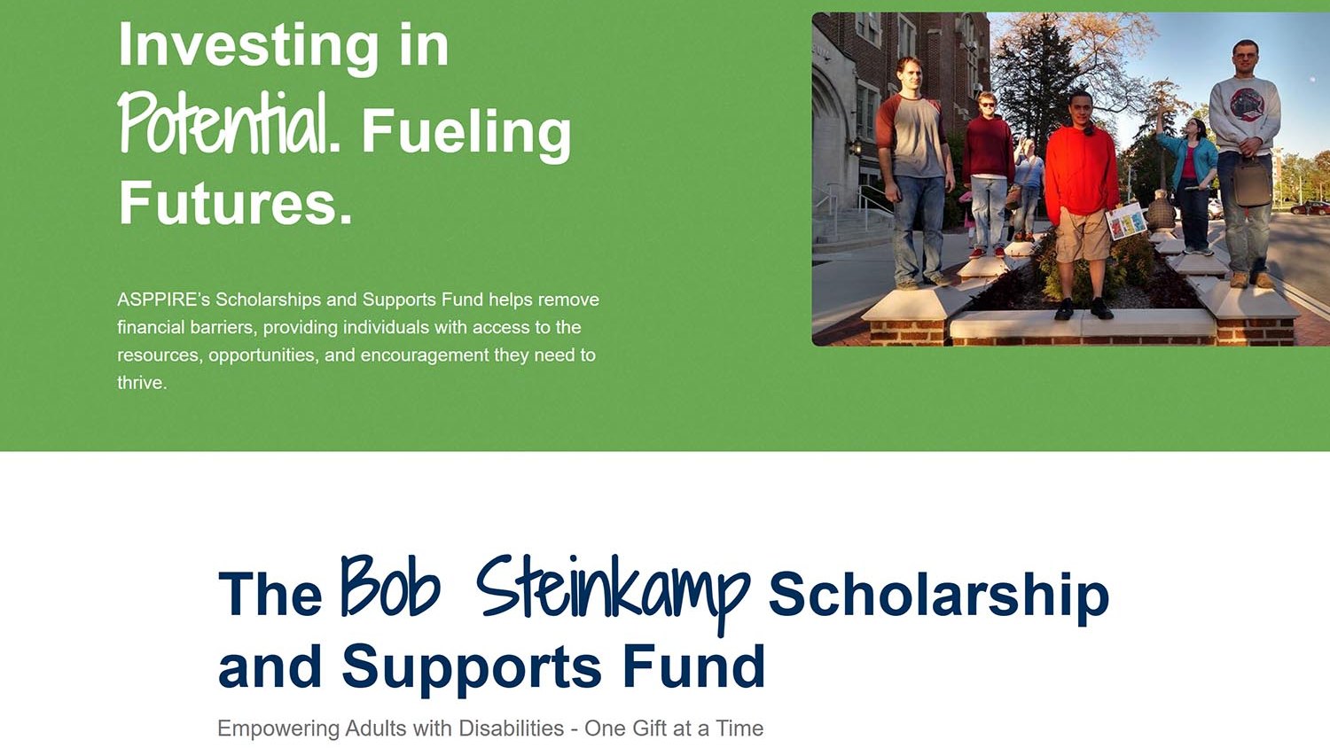
ASPPIRE now has a website that looks like the size of its ambition rather than the size of its budget. Programs are findable. Events go up fast. Donations and volunteer signups are two clicks from anywhere. And nothing in the day-to-day got harder for the people running it.
That last part matters more than it sounds. The most common way a nonprofit website fails is not that it looks bad — it’s that it becomes something nobody on staff feels able to update, and it slowly goes stale. We built this one to be added to.