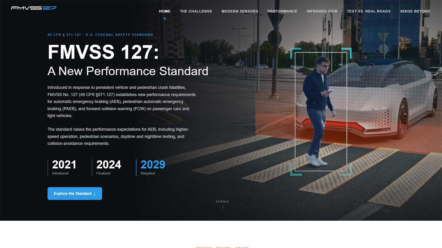

FMVSS 127 is a US federal motor vehicle safety standard that mandates forward collision warning and automatic emergency braking — including pedestrian detection — across new light vehicles. It is dense, consequential, and genuinely difficult for the industry to meet, particularly at night.
Our client wanted a site that explained the standard clearly and made the technical case for infrared sensing as part of the answer. What they gave us to work with was the subject matter and nothing else. No logo. No brand guidelines. No photography. No colour palette. No existing identity to extend.
And a two-week window.
The identity problem here is unusual. The site isn’t branded as a company — it is branded as a regulation. It needed to read as authoritative and neutral, closer to a technical reference than a marketing site, while still clearly being a considered piece of design rather than a government PDF.
We built a wordmark from the standard’s own designation and paired it with a restrained white-and-blue palette — institutional enough to carry authority, clean enough to stay modern. Typography does most of the work: generous headline scale, disciplined body copy, and full-width photography that carries the subject matter without stock-photo gloss.
The imagery is the argument. Crosswalks at night, parallel-path scenarios, low-visibility conditions — each picture is doing the same job as the copy beside it, which is to make an abstract compliance problem feel like a real intersection at ten o’clock.
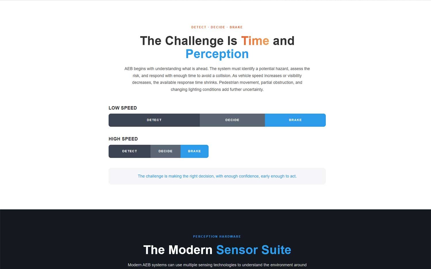
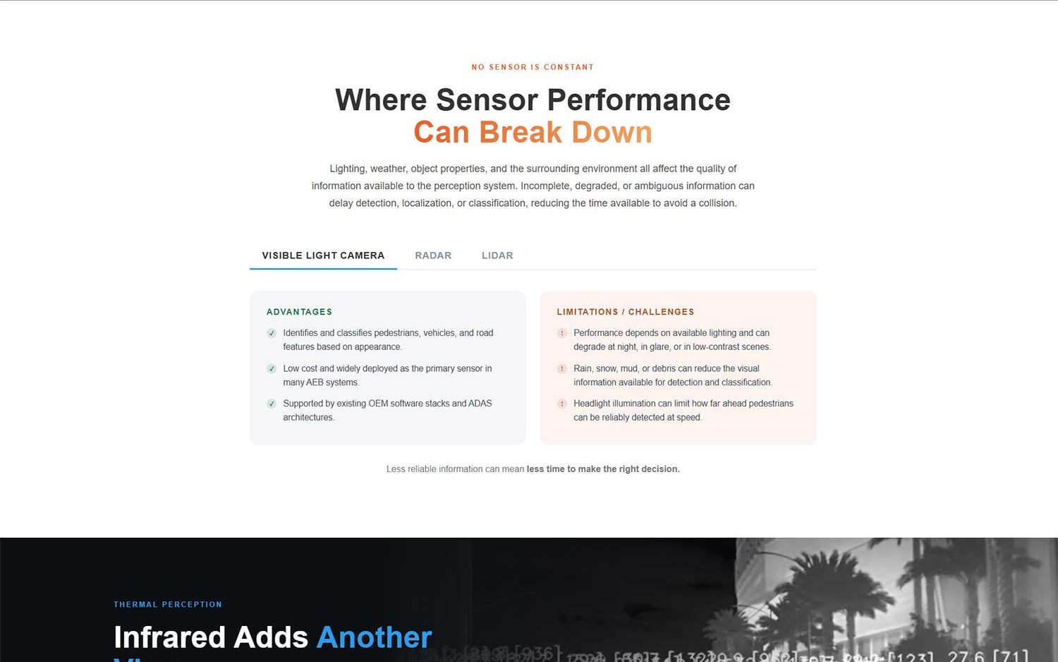
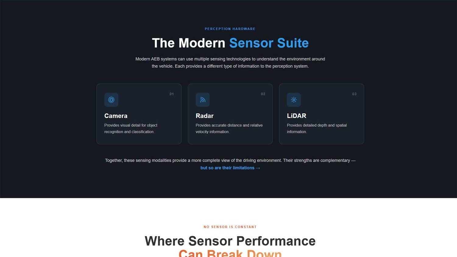
This is not a brochure site with a services list. It is a structured technical argument, and the order of the page carries it: the standard and what it requires, the challenge of meeting it in time, the sensors vehicles rely on today, where each of them can break down, where infrared fits, and how the test track compares with real roads.
Each section follows the same editorial rhythm — a headline that states a position, then the image and evidence that support it. The case builds rather than repeats. By the time a reader reaches infrared, the argument has already been made for them by the physics.
The tone stays measured throughout. A page like this loses credibility the moment it oversells, so the copy concedes what infrared does not do as clearly as it claims what it does — it complements existing sensors rather than replacing them. Engineers trust writing that admits limits.
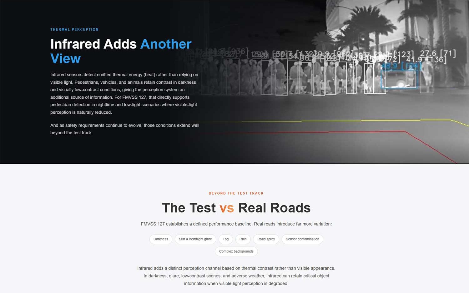
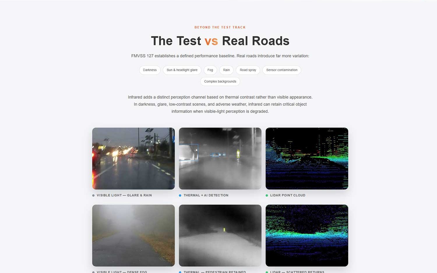
The site shipped inside the two-week window with a complete identity, original imagery, and an argument that holds together end to end. It works as a standalone education resource and as a considered route into the client’s wider automotive safety business.
The first release ran across seven long-form pages. We have since rebuilt it as a single-page treatment that compresses the same argument into one continuous scroll, so a reader can take in the whole case in about ninety seconds and still go deep where they want to.